
A map of America in 1860 offers a stark visual representation of a nation teetering on the precipice of civil war. It’s a snapshot of a deeply divided land, highlighting both the territorial expansion of the United States and the escalating tensions that would soon erupt into open conflict.
Territorial Extent and Political Divisions
The map showcases a significantly larger United States than the one envisioned by the Founding Fathers. Through westward expansion, fueled by Manifest Destiny and treaties with European powers and Native American tribes (often forced and unjust), the country stretched from the Atlantic to the Pacific. States like California, Oregon, and Texas had been added relatively recently, fundamentally altering the nation’s demographics and political landscape.
Politically, the map reveals the deep fault lines threatening to shatter the Union. The most prominent feature is the distinction between free and slave states. The stark visual contrast emphasizes the moral, economic, and political chasm that separated the North and the South. The states of the North, with their industrializing economies and growing abolitionist movements, stand in sharp contrast to the agricultural South, heavily reliant on slave labor for its economic prosperity. Slave states are concentrated in the Southeast, forming a powerful bloc determined to maintain their way of life.
Border states like Missouri, Kentucky, and Maryland occupied a precarious position, geographically and ideologically. These states held significant populations who supported both sides of the slavery debate, making them pivotal in the coming conflict.
Territories and Native American Lands
Vast territories, largely unorganized and sparsely populated, dominated the western portion of the map. These territories, including Kansas, Nebraska, and Utah, were crucial battlegrounds in the slavery debate. The question of whether these territories would enter the Union as free or slave states fueled intense political conflict, leading to violence and further dividing the nation. Kansas, in particular, became a bloody proving ground for the conflict, earning the moniker “Bleeding Kansas.”
The map also reveals the shrinking lands designated for Native American tribes. Through treaties and forced removals, Native American populations had been displaced and confined to reservations, a process that continued throughout the 19th century. The map serves as a reminder of the injustices inflicted upon Native American communities during this period of expansion and conflict.
Economic Differences
While not explicitly depicted, the map implicitly reveals the stark economic differences between the North and the South. The North, with its industrial cities and burgeoning railroad network, was rapidly modernizing. The South, on the other hand, remained largely agrarian, with its economy heavily dependent on cotton production and slave labor. This economic divergence fueled political tensions, as the two regions clashed over issues such as tariffs, infrastructure development, and the expansion of slavery.
In conclusion, a map of America in 1860 is more than just a geographical representation; it’s a historical document that encapsulates the complex political, social, and economic forces that were pulling the nation apart. It’s a visual testament to a nation on the brink of civil war, a conflict that would forever transform the American landscape.
 1300×988 map showing seceding states date civil war from www.alamy.com
 1500×992 usa map printable map usa from printablemapofusa.com
 2500×2098 coltons physical map united states america inset from artsourceinternational.com
 932×500 political map usa fallon selestina from harriettomandi.pages.dev
 2500×2088 coltons physical map united states america art source from artsourceinternational.com
 600×500 abraham lincoln kevin wood activities usa map from www.mrlincoln.com
 900×562 map usa december from ar.inspiredpencil.com
 1588×1231 print map united states etsy from www.etsy.com
 1024×654 election electoral map civil war reconstruction era from saltypop.blogspot.com
 900×600 map united states territories canada from pixels.com
 600×378 territorial maps map united states map history from www.pinterest.com
 1140×855 usa map civil war civil war map secession etsy from www.etsy.com
 819×517 map from worksheetcampuspablo.z13.web.core.windows.net
 700×835 coltons map north america art source international from artsourceinternational.com
 1300×993 united states north america early territorial boundaries lowry from www.alamy.com
 613×493 lesson plans civil war reconstruction from bookunitsteacher.com
 660×574 map united states tessin from tessin.weebly.com
 1300×996 map res stock photography images alamy from www.alamy.com
 1300×1119 civil war map from ar.inspiredpencil.com
 920×588 kalarhythms georhythms history overview from kalarhythms.org
 900×593 border states from ar.inspiredpencil.com
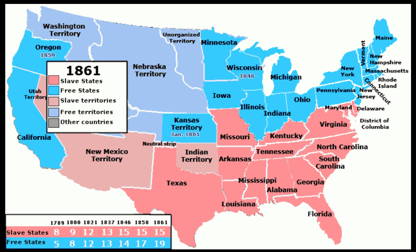 1587×961 iowa heritage from ouriowaheritage.com
 1671×1110 map united states secession from www.emersonkent.com
 1600×1228 antique map united states mexico stieler from maps-prints.com
 1206×647 civil war maps north south from ar.inspiredpencil.com
 377×512 ettling antique civil war map north america from www.liveauctioneers.com
 1048×762 united states thearesproject deviantart from www.deviantart.com
 990×611 united states civil war map gallery from oldmapgallery.com
 600×777 johnsons north america geographicus rare antique maps from www.geographicus.com
 1000×677 citizen general star spangled banner american civil war from forums.sufficientvelocity.com
 1024×768 united states america map from answerfullplaudit.z14.web.core.windows.net
 800×490 robert lee from www.globalsecurity.org
 900×620 historical atlas north america december omniatlas from omniatlas.com